
Logodesign and branding for „Susanne Rademacher Coaching“
{:en}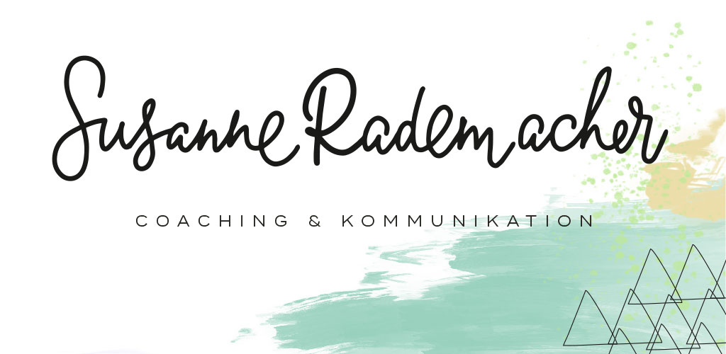
You probably know Susanne Rademacher`s wedding blog „Lieschen heiratet“ but never knew that she is not a full time blogger. She started her career in advertising and in 2011 started her onw business with „Fleißiges Lieschen“, concentrating on helping clients, mainly lifestyle and food related, with PR, social media and blogger relations. Additionaly she works as a freelance author and coach in the wedding industry. Beginning of this year she has finished her system coaching training. Wow, this lady is seriously full of energy. 2017 is the year that she is merging all her passions in a new business – „Susanne Rademacher Coaching & Kommunikation“. She concentrates on coaching creative professionals, small busnesses and startups. And it was for this new business that Susanne asked me to work with her on creating a new logo and branding.
Moodboard for Susannes Branding
It all starts with Ideas and creating a moodboard that shows where you are heading with the design. Susanne wanted her new logo and branding that feels very professional, but at the same time communicate her creative side. So we worked on a moodboard that would do just that, feel colourful and creative, but structured and streamlined at the same time. Happy and outgoing without going overboard.
![]()
Moodboard Susanne Rademacher
Brand values
At the heart of a branding there are always the values you and your company have. It`s important to have them defined as clearly as possible, to later communicate these in your new branding. These values are important in figuring out the visual feel of your branding, and they are at the core of all communications. What do you want the customer to feel when he comes in contact with your business? These values should be communicated on all chanels and across all materials, from website to business card, phone call to email.
Susanne´s values are * fresh* outgoing * creative * structured *
Logo design and Sub Marks for Susanne Rademacher Coaching & Kommunikation
The logo we finally went with is a uniquely handlettered version, happy, creative, but at the same time reduced and professional. To be able to work in different formats there is a variation of Susanne`s logo. Submarks were needed, to later use as stickers and stamp.
Colours, patterns and textures for Susannes branding
The Logo is only one part of the branding. In addition it helps to have some great patterns and textures to create a brand design. In this case we went for happy pastels and combine them with some black and a lot of white. Patterns and textures are colourful and fun, just like Suanne herself.
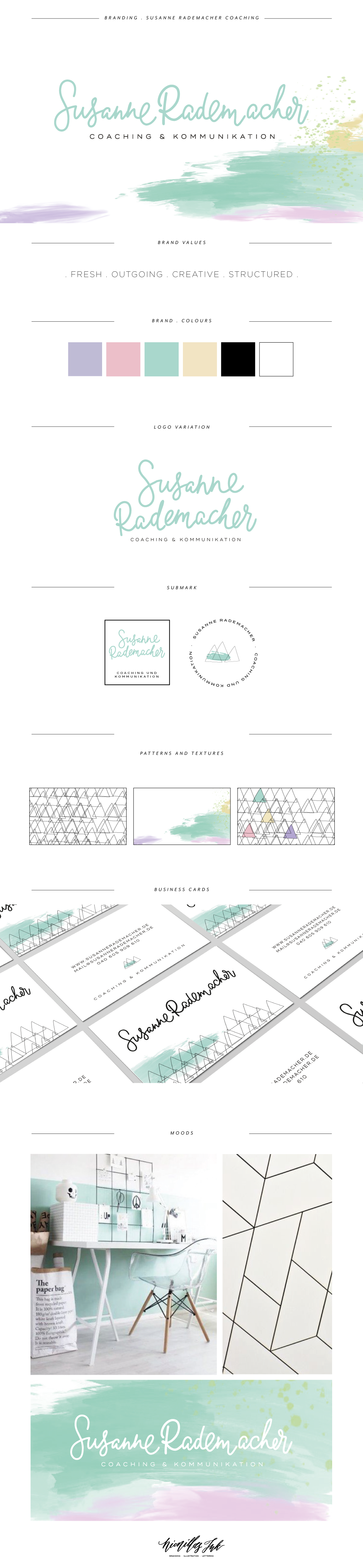
Branding Board for Susanne Rademacher Coaching
Business card design
For her business card design we decided to combins some happy and colourful elements with her logo in black. This way the look is bright and fun, but still professional.
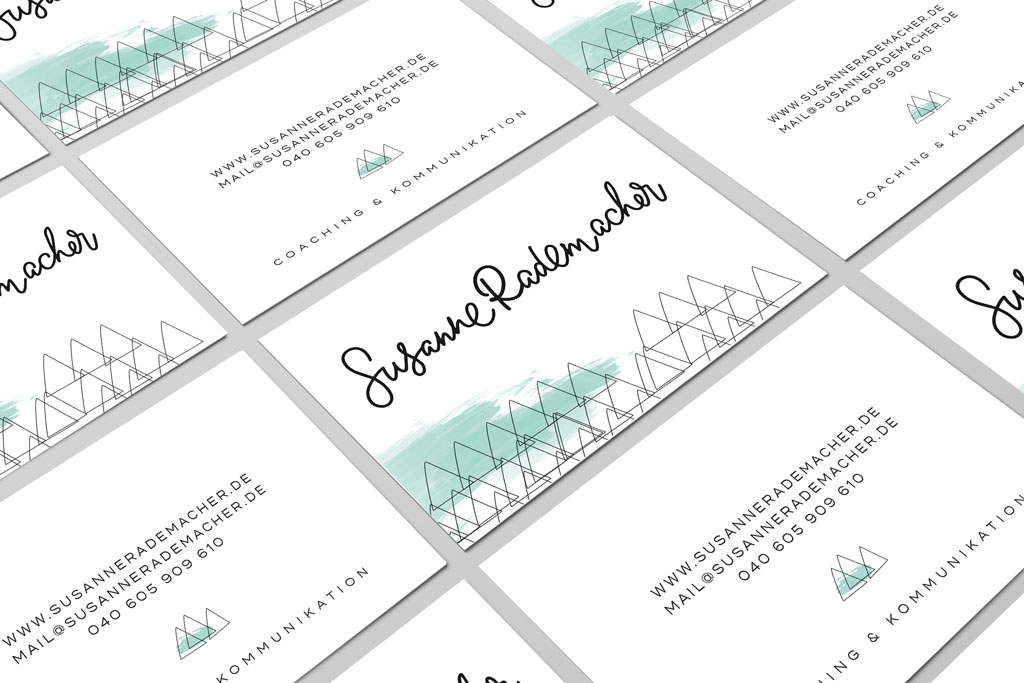
Visitenkarten Susanne Radermacher Coaching
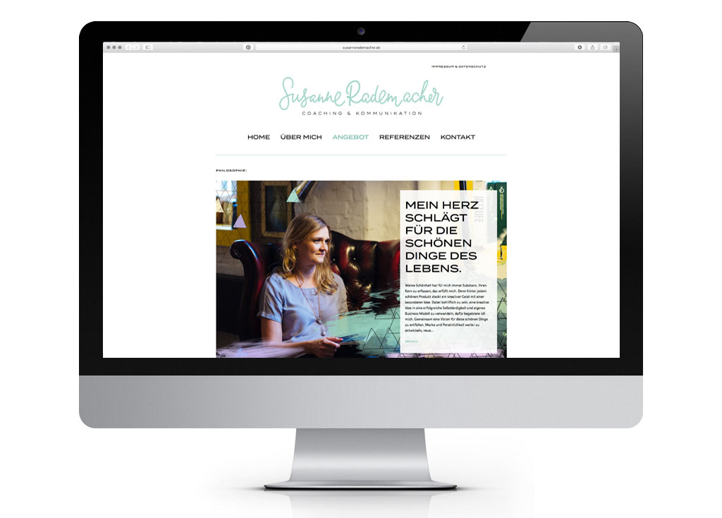
The website
Finally all elements, colours and textures were used to create a new website. With the help of Torben Tschechne Susanne`s new website „Susanne Rademacher“ was created. Go on, have a look…
If you like this you might want to read about this, too
Branding for Björn Wessel Fotografie

Branding for Björn Wessel Fotografie
{:}{:de}
Viele kennen Susanne Rademacher durch ihren Hochzeitsblog „Lieschen heiratet“ und wissen garnicht, dass das Bloggen nur ein Teil von Susannes Alltag ist. Ursprünglich kommt sie aus der Werbung, 2011 hat sie ihr eigenes Beratungsbüro „Fleißiges Lieschen“ für PR, Social Media und Blogger Relations gegründet. Hier hat sie Kunden aus dem Lifestyle und Food-Segment betreut. Nebenbei schreibt sie als freie Autorin und beitreibt zusammen mit Pinar Sahin die Hochzeitsgesellschaft. Nebenbei hat Susanne noch eine Ausbildung zum systematischen Coach absolviert – ganz fleißiges Lieschen eben. 2017 ist nun für Susanne das Jahr, in dem sie alle miteinander verbindet und unter ihrem eigenen Namen, „Susanne Radermacher – Coaching & Kommunikation“, als Business Coach und Kommunikationsberaterin für Kreative, Existenzgründer und Unternehmen tätig ist. Im Zuge dieser beruflichen Veränderung, bat Susanne mich, ein neues Logo und passendes Branding zu entwickeln.
Moodboard für Susannes neues Branding
Zu Beginn geht es immer erstmal darum, erste Ideen mit einem Moodoard in eine visuelle Form zu bringen. Susannes Wunsch war es, ein Branding/Logo für den Bereich Coaching + Kommunikation zu haben, das zwar professionell ist, aber dabei ihre Kreativität in den Vordergrund stellt. Diese Gegensätze, die Susanne so schön mit „klare Linie mit Konfetti im Kopf“ beschreibt, sollten auf jeden Fall visuell auf das neue Branding übertragen werden. So entstand ein Moodboard, das kreativ und bunt ist, aber mit einer ganz strukturierten Klarheit sehr professionell ist. Fröhlich und offen mit dem Blick für`s Wesentliche.
![]()
Moodboard Susanne Rademacher
Marken Werte definieren
Die Pfeiler eines Brandings sind immer die Werte, die ein Unternehmen hat. Um eine klare Linie zu haben, ist es wichtig, diese Werte ganz eindeutig zu definieren und sich immer wieder dran zu erinnern. Diese Werte sind nicht nur wichtig für den visuellen Look des Brandings, sondern besonders im Alltag. Es sind die Grundlagen, auf die sich die komplette Kommunikation eines Unternehmens stützt. Wie möchte ich auf meine Kunden wirken, wie sollen sie sich fühlen, wenn sie mit mir und meinem Unternehmen in Kontakt kommen. Diese Werte sollten über alle Kommunikationskanäle – von der Visitenkarte bis zur Website, vom Telefonat bis zur Mail – spürbar sein. Sie sind das Herz des Unternehmens.
Susannes Werte sind * fresh* outgoing * creative * structured *
Logo design und Sub Marks
Für das Logo haben wir einen individuellen Schriftzug entwickelt, der sowohl fröhlich und kreativ, aber auch klar und professionell ist. Passend dazu gibt es natürlich eine Logo Variante, immer hilfreich, wenn man doch mal andere Formate bespielen muss. Auch Submarks, die sich gut eignen, um Sticker oder Stempel zu erstellen, dürfen nicht fehlen.
Branding Farben, Muster und Texturen
Das Logo ist immer nur ein Teil des Brandings, Farben, Muster und Teturen sind ein weiterer Baustein, mit dem man wunderbar die Werte eines Unternehmens visualisieren kann. Fröhliche Pastelltöne sind perfekt für Susannes kreatives Unternehmen. Um ein gewisses Maß an Klarheit und Seriösität zu integrieren, kombinieren wir schwarz und weiß. Muster und Texturen sind bunt und fröhlich, so wie Susanne selbst.
Branding Board for Susanne Rademacher Coaching
Visitenkarten Design
Auch hier gilt es, klar und strukturiert mit fröhlich bunt zu kombinieren. Um eben diese Klarheit zu erhalten, haben wir uns dazu entschieden, Susannes Schriftzug und Kontaktdaten dezent schwarz zu halten und als Farbtupfer ein Muster einzusetzen.
Visitenkarten Susanne Radermacher Coaching
Die Webseite
Auch die Webseite sollte immer zur visuellen Optik des Brandings passen, Farben, Schriften, Texturen, all das kann hier verwendet werden, Gemeinsam mit Torben Tschechne hat Susanne ihre neue Webseite „Susanne Rademacher“ erarbeitet. Schaut doch mal vorbei, es lohnt sich…
If you like this you might want to read about this, too
Branding for Björn Wessel Fotografie
Branding for Björn Wessel Fotografie
{:}

Shamim
4. Oktober 2017 at 22:33Great post!
Mira Edorra
10. Dezember 2017 at 18:54Wow!
Helpful post!
I love Susanne Rademacher Coaching & Kommunikation so much! ????
Thanks a lot for sharing this amazing post with us!
Love your blog .??
Nicole Sprekelmann
11. Dezember 2017 at 10:32Thank you very much Mira, I am glad you like it.