When Anna first approached me, she did so because she felt she wanted to revamp her brand. She had outgrown her old name „Schokoladenseiten“ and felt that her logo and website no longer represented her brand. Anna has evolved so much, has grown as a person and her style of work has also matured and changed, so that the old identity simply felt too small and outdated. And when you feel that your old look feels like it is holding you back, you might even cringe when looking at your own logo, you know it`s time to let go and move on.
READ MORE![]() It is so important and yet it gets overlooked often – choosing your own ideal customer archetype. You might actually think that you don’t really have much say in this, and you will take whatever comes along, but really, there is a much better and more effective strategy to this. And it will actually help you create more meaningful relationships with your customers and a business you feel aligned with.
It is so important and yet it gets overlooked often – choosing your own ideal customer archetype. You might actually think that you don’t really have much say in this, and you will take whatever comes along, but really, there is a much better and more effective strategy to this. And it will actually help you create more meaningful relationships with your customers and a business you feel aligned with.
 I am so excited to share this project with you, even though it really isn`t new anymore… You know that great things are about to happen when a photographer couple whose work you adore contact you for a re-brand. Farina and Hannes, the two photographers behind Mister & Misses Do felt that their current brand did not quite fit anymore and didn`t reflect their business and style anymore. Their business had grown so much in the last years and they wanted a look that would communicate their free spirit and wanderlust.
{:en} You probably know Susanne Rademacher`s wedding blog „Lieschen heiratet“ but never knew that she is not a full time blogger. She started her career in advertising and in 2011 started her onw business with „Fleißiges Lieschen“, concentrating on helping clients, mainly lifestyle and food related, with PR, social media and blogger relations. Additionaly she works as a freelance author and coach in the wedding industry. Beginning of this year she has finished her system coaching training. Wow, this lady is seriously full of energy. 2017 is the year that she is merging all her passions in a new business – „Susanne Rademacher Coaching & Kommunikation“. She concentrates on coaching creative professionals, small busnesses and startups. And it was for this new business that Susanne asked me to work with her on creating a new logo and branding.
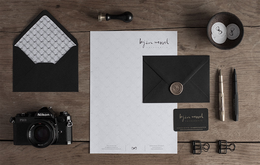
 Björn wanted a new design for his business that would really communicate his values and set him apart from all those other wedding photographers. We analyzed his style and realized that he was not the typical wedding photographer, all set in pastels, watercolor washes and flowers. Very far from it, actually. He defined himself as a gentleman though and through, usually wearing a suit and a bow tie when he was shooting a weddings. So we created a black and white design for the new branding around this manly feel. The new design would be very reduced in color and just use black, white and gold. The feel we wanted to create was one of casual elegance.