
1. Februar 2018
New logo design for Photographer Anna Mardo
When Anna first approached me, she did so because she felt she wanted to revamp her brand. She had outgrown her old name „Schokoladenseiten“ and felt that her logo and website no longer represented her brand. Anna has evolved so much, has grown as a person and her style of work has also matured and changed, so that the old identity simply felt too small and outdated. And when you feel that your old look feels like it is holding you back, you might even cringe when looking at your own logo, you know it`s time to let go and move on.
READ MORE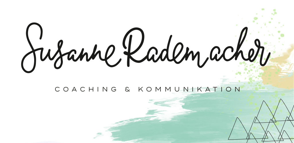 You probably know Susanne Rademacher`s wedding blog „Lieschen heiratet“ but never knew that she is not a full time blogger. She started her career in advertising and in 2011 started her onw business with „Fleißiges Lieschen“, concentrating on helping clients, mainly lifestyle and food related, with PR, social media and blogger relations. Additionaly she works as a freelance author and coach in the wedding industry. Beginning of this year she has finished her system coaching training. Wow, this lady is seriously full of energy. 2017 is the year that she is merging all her passions in a new business – „Susanne Rademacher Coaching & Kommunikation“. She concentrates on coaching creative professionals, small busnesses and startups. And it was for this new business that Susanne asked me to work with her on creating a new logo and branding.
 Björn wanted a new design for his business that would really communicate his values and set him apart from all those other wedding photographers. We analyzed his style and realized that he was not the typical wedding photographer, all set in pastels, watercolor washes and flowers. Very far from it, actually. He defined himself as a gentleman though and through, usually wearing a suit and a bow tie when he was shooting a weddings. So we created a black and white design for the new branding around this manly feel. The new design would be very reduced in color and just use black, white and gold. The feel we wanted to create was one of casual elegance.
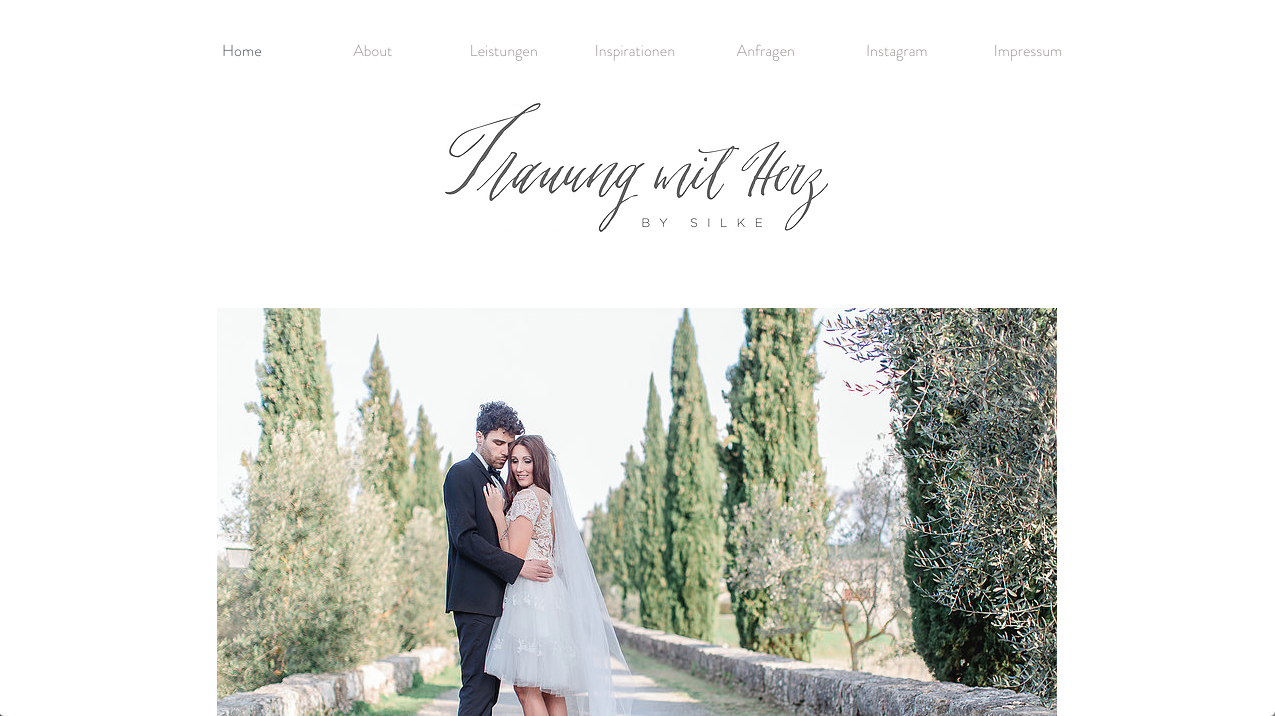 Ich freue mich so, endlich 2 neue Logos zu zeigen, die ich für die liebe Silke Hechler entwickelt habe. Silke ist Hochzeitsplanerin und kreiert wahre Traumhochzeiten für ihre Kunden. Im letzten Jahr hat sie sich zusätzlich als Treurednerin weitergebildet und mit Trauung mit Herz ein neues Unternehmen gegründet. In diesem Zuge sollte auch der Look der beiden Unternehmen überarbeitet werden. Der Wunsch war es, 2 Logos zu entwickeln, die einzeln funktionieren, aber dennoch gut miteinander harmonieren und so eine gemeinsame Marke bilden.
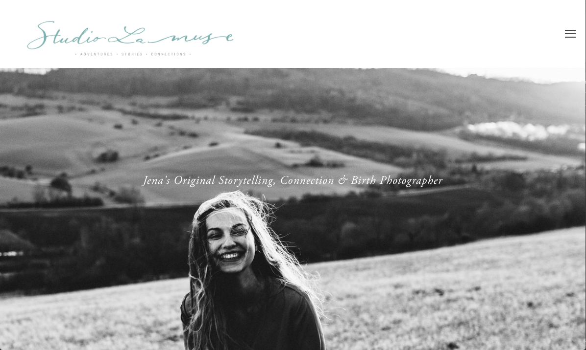 Heute ist es endlich so weit und Ashleigh Raddatz, Fotografin aus Jena, eröffnet ihr Fotostudio – Studio La muse. Ashleigh ist ein bezaubernder Mensch und es hat wahnsinnig Spaß gemacht, mit ihr zu arbeiten. Nicht zusetzt wegen ihres süßen amerikanischen Akzents. Spezialisiert auf Storytelling, Connection & Birth Fotografie, wird ihr Studio ein Treffpunkt und eine Quelle der Inspiration sein. Ich freue mich, dass ich dieses traumhafte Projekt endlich teilen darf!
